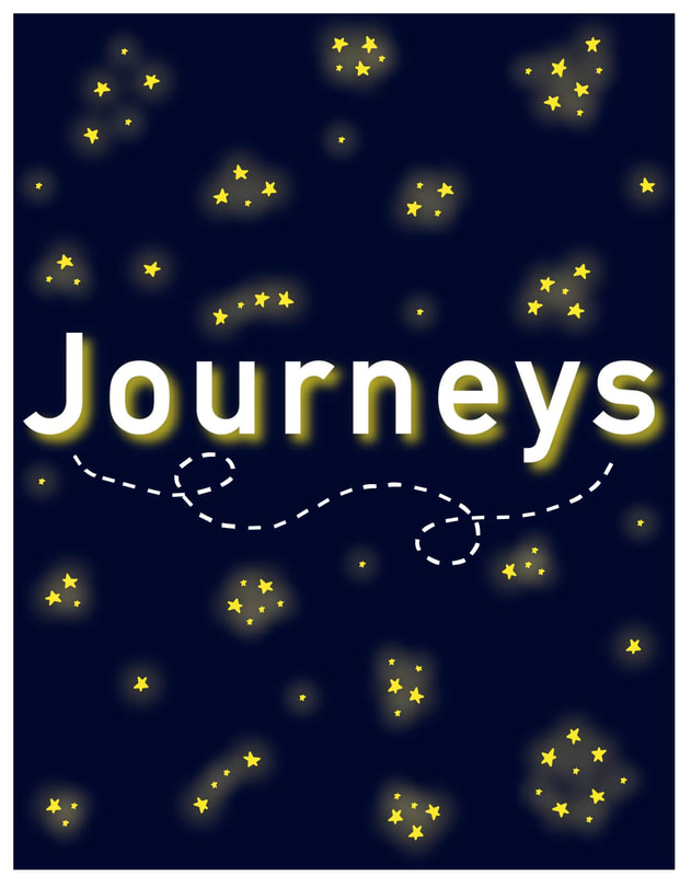
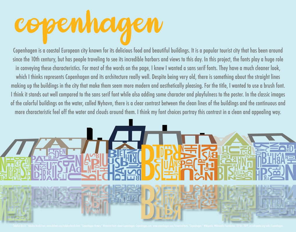
 The hardest part of this poster was making the graphic overall. It took a lot of time to get all of the letters aligned the way I wanted them to be and in a way that actually looked like houses. I thought I would just be placing letters wherever within each house, but quickly realized I needed to take my time in choosing which letter went where, which direction it was facing, and how large or small it was. This took my the most time, but it was a lot easier once I got the hang of it. I think I will definitely consider typography more seriously in the rest of my projects. They may not all incorporate a large graphic made of text, but I will pay more attention to the fonts I am using and how they are arranged on the page because of this project. I think typography, even at the most basic level, is an important part of poster design. When the right fonts are chosen, the project is better and more cohesive overall. I am really happy with the colors and the overall feel my poster gives off. I think it represents my design style really well, and I felt like it was one of my first projects that did this. I like the houses and the reflection a lot, but I am still unsure about the roofs of the buildings and if they way I created represents the actual roofs in the best way. Overall, I am proud of how this project turned out. It seemed like an impossible task when it was first assigned, but with time and effort I was able to break it down into manageable and enjoyable pieces.
|