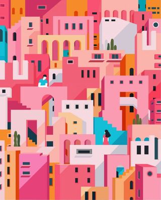
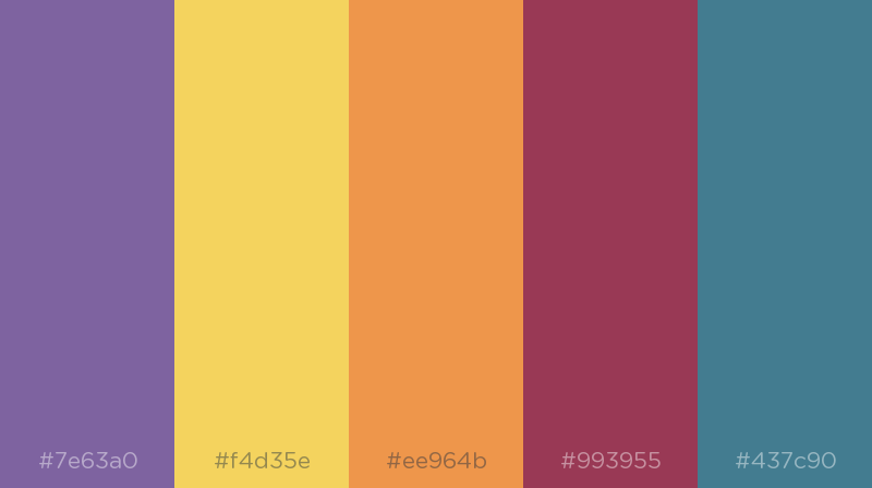
 I think that color will play a huge role in this flyer. I want to portray a fun and imaginative vibe without being too bold and overbearing. I created my palette by using shades of the colors from the logo, and then shuffling until I found other colors that I thought worked well with them.
0 Comments
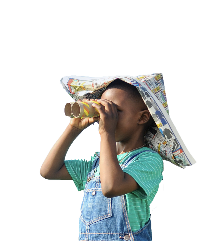
My flyer is going to be about the charity KaBOOM. I will recreate the logo above and incorporate it into my flyer, as well as make graphics from some of the pictures above. I will use the KaBOOM website (https://kaboom.org) as inspiration. The eight sentences I plan to include as a description are as follows:
At the foundation of childhood is imagination and play. Kids thrive when they have somewhere where they can learn and explore actively. However, not all children have access to safe places where they can play. KaBOOM is dedicated to creating these spaces in low-income communities so all kids have the opportunity to simply be kids. It is a national non-profit organization that believes that by improving life for children, we can improve life for everyone. Since being founded in 1995, KaBOOM has built and improved over 17,000 playgrounds, athletic fields, skate parks, and other play spaces. In doing so, they have helped serve more than 10 million children. The charity works with various partners and volunteers to make a lasting impact on communities and the children living in them. poster after class critique and edits: 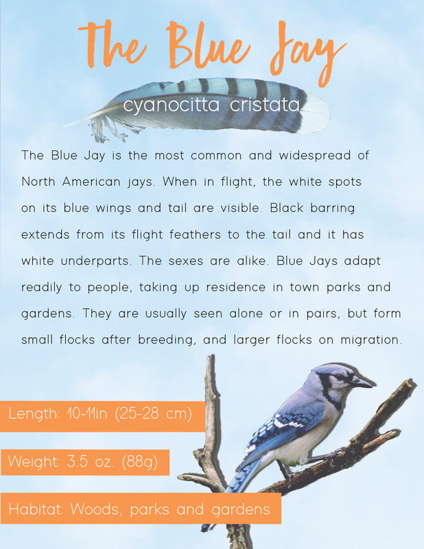 poster before class critique and edits: 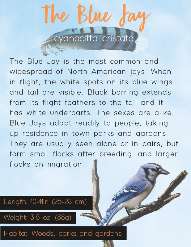 My first experience in InDesign was uncomfortable for me at first. I didn't know how to do certain things and when I tried to fix or change things I got frustrated because it took me multiple attempts. I think this was a good project to help me adjust to InDesign and I am confident that I will get more comfortable with it as the year progresses. I approached this project somewhat unsure of what I wanted my poster to look like. Once I got going, I tried to stick with the fluid flight pattern of the bird and the whimsical feel they have. I tried to do with the title font and the subtle image on clouds overplayed in the background. The most challenging thing for me was just getting used to how InDesign works. Like I said before, I struggled with how to do things and I got my layers confused sometimes. I also had trouble with accepting the fact that this was only the first project and I was going to make mistakes no matter what. I think there were aspects of my poster that turned out the way I wanted them to but there were also definitely things I think I could have done better and will learn how to improve this year. I think I achieved good proximity by separating the length, weight and habitat from the rest of the information. I also think I left a good amount of space in and around the text so that, even though it's long, it felt lighter and easier to read. Overall, I am proud of myself for overcoming the struggles I faced in getting to know InDesign and I look forward to learning new skills and ways to improve this year.
|