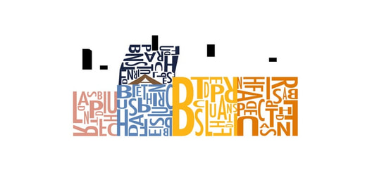
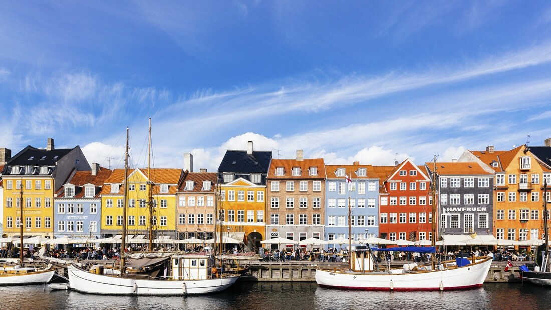
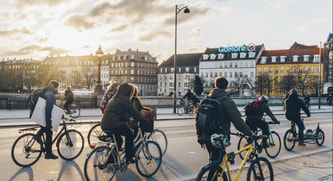
  Copenhagen, Denmark is a coastal European city known for its delicious food and beautiful buildings. It is a popular tourist city that has been around since the 10th century, but still has people traveling to see its incredible harbors and views. In this project, the fonts play a huge role in conveying these characteristics. For most of the words on the page I knew I wanted a sans serif fonts. They have a much cleaner look, which I thinks represents Copenhagen and its architecture really well. Despite being very old, there is something about a lot of the buildings in the city that make them seem more modern and aesthetically pleasing. For the title, I wanted to use a brush font. I think it stands out well compared to the sans serif font while also adding some character and playfulness to the poster. In the classic images of the colorful buildings on the water, called Nyhavn, there is a clear contrast between the clean lines of the buildings and the continuous and more characteristic feel off the water around them. I think my font choices portray this contrast in a clean and appealing way. “Adelica Brush.” Adelica Brush Font, www.dafont.com/adelica-brush.font.
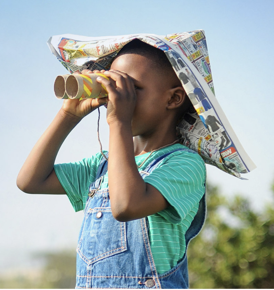
“Copenhagen History.” Historical Facts about Copenhagen - Copenhagen.com, www.copenhagen.com/historical-facts. “Copenhagen.” Wikipedia, Wikimedia Foundation, 22 Oct. 2019, en.wikipedia.org/wiki/Copenhagen. final copy of flyer: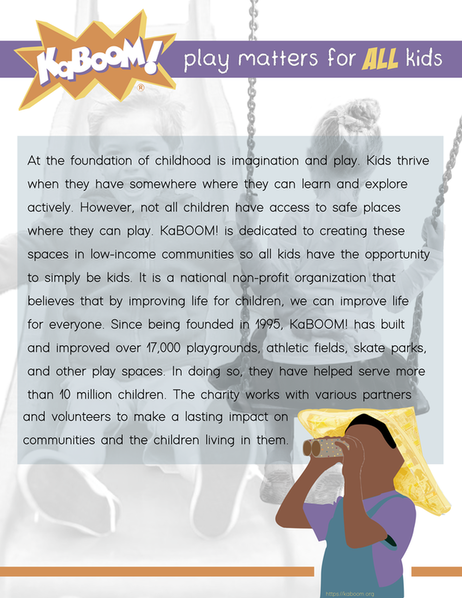 flyer before critique: first draft of flyer: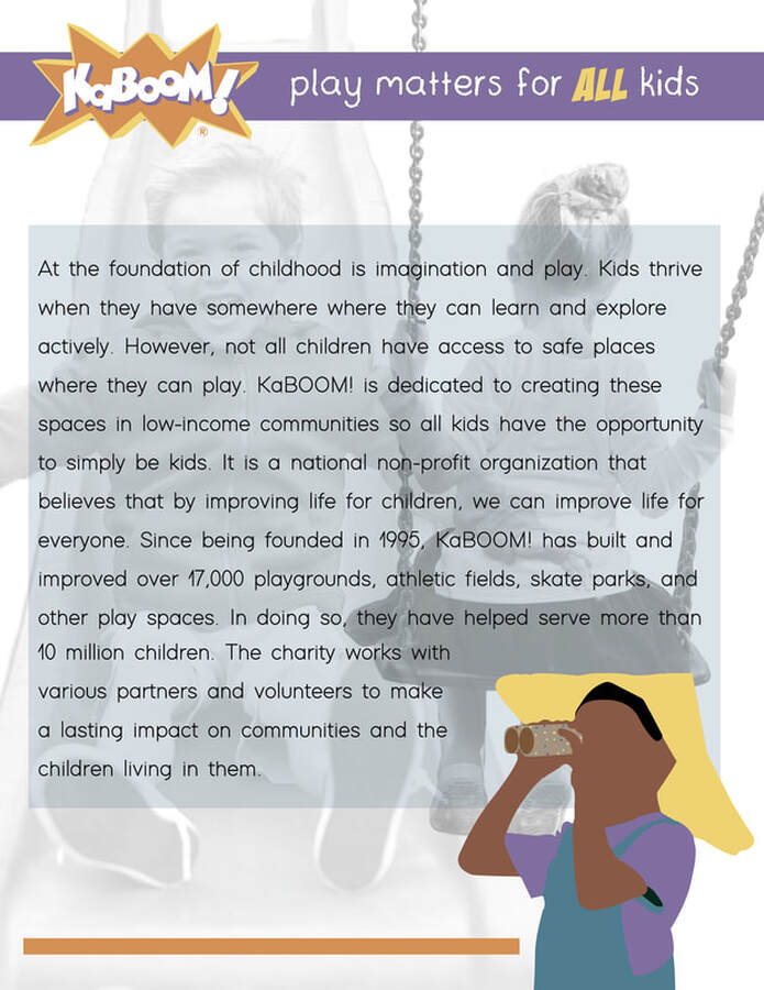 My layout helps guide the viewers eyes in many ways. The photographs of the boy going down the slide and the girl on the swings in the back of the flyer add a lot of movement. They bring your eyes from the top of the page all the way down to the bottom. The repetition of color throughout the page also helps guide the viewers eyes around the flyer. My graphics add a playful element to the poster. The majority of the color in the flyer is introduced in the graphics. They make the page more fun, colorful, and imaginative. I think this is important because it helps to portray the overall message of the charity. The boy with binoculars also shows a child looking into a future where everyone has a safe place to play. I considered proximity a lot in this poster. I wanted there to be a lot of open space on the page, but I had trouble with this at first because there were so many requirements I needed to meet. I decided to make the photographs transparent so that they added character to the page but didn't take up a ton of space. This allowed me to make the text more spread out and therefore more breathable. Colors and patterns are repeated a lot throughout the page. I used repetition of boxes and lines at the top, middle, and bottom of the page. I also repeated color numerous times. I used orange in the logo and at the bottom, I used purple in the logo, on the line, and on the boys shirt, I used yellow in the logo, slogan, and in the boys hat, and I used blue in the overalls and in the box behind the text. I also used all these colors as dots on the boys binoculars. Alignment played a huge role in where I put things on the page as well. I aligned all the horizontal lines and boxes with each other to make a more clean look, and then aligned the title text and logo with the box around the body text. I also aligned the text around the boy to draw eyes from the end of the text to the boy. Finally, I considered contrast with the complimentary colors of orange and blue, and purple and yellow. They balance each other out really well. Contrast of black and white with these colors was important in the poster because it created a separation between the goals of the charity and the reality of society, which might make people want to help make the same thing. I think I used the elements of design well in this project and I am overall happy with the way it turned out.
|